Apple Releases New iOS 14 Update
October 16, 2020
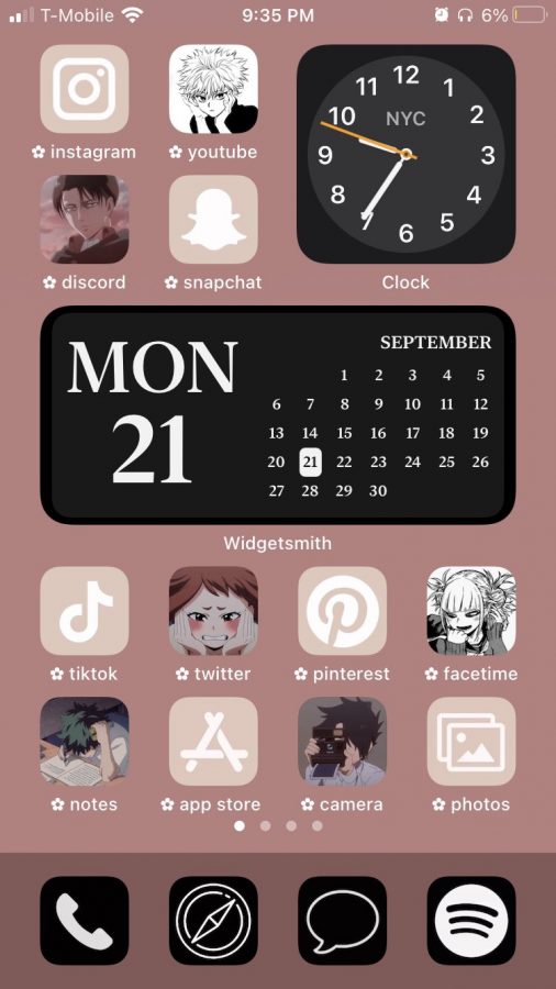
On September 16th, Apple released the new iOS 14 update, introducing a redesigned Home Screen that supports a feature foreign to the iPhone: widgets. Since the launch, social media users have praised this feature, showing off their new custom Home Screens that are themed anything from Among Us to Harry Potter.
Not only does iOS 14 bring us a redesigned Home Screen, but it also provides many other major features that Apple users, including myself, have all been waiting for. The explosion of custom Home Screen designs all over my For You Page on TikTok has captured my attention and inspired me to examine these new features myself.
That being said, let’s take a look at some of these amazing new features Apple has brought us this update.
Security
For those of us who are afraid of surveillance, Apple has taken security greatly into consideration for this new update. Features such as the recording indicators have been added to ensure our safety while using apps.
These new recording indicators are shown as a green dot (the camera is being used) or an orange dot (the microphone is on) in your status bar above the WiFi signals.
It is no secret that social media platforms have accessed cameras and microphones of active users’ phones without them knowing. If your recording indicators are activated while your camera or microphone is not in use, open your control center to check the most recently used app. This way you can check that apps are not secretly recording or filming you in the background.
Compact Notifications
Whether you’re playing a game or typing a text message, there is nothing worse than having your screen being taken over by an incoming phone call.
iOS 14 has gotten rid of these full-screen call notifications, and they are now shown as banners at the top of your screen. You have the option to accept, reject, or dismiss the call, without losing track of your current activity. This new feature is already decreasing my moments of frustration, so I have Apple to thank for that.
Custom Home Screens
What kind of iOS 14 review would this be if I didn’t talk about the custom Home Screens?
The glamorous, media-consuming Home Screens have convinced me that mine needs a serious makeover. Yes, these customization features were available on Androids for years now; however, this is an exciting change for experienced Apple users accustomed to the standard layout of their home screens.
I was excited to start playing around with the widgets and color coordinating my app icons, creating a cohesive theme that would express my “aesthetic.”
The iOS 14 update comes with your standard utility widgets. In order to personalize them, you need to download separate apps on your iPhone. I used the app WidgetSmith the most to create my photo widgets.
When you open the app, there are three widget size options to choose from. Press “add widget” to select your photo. Rename your photo widgets to make it easier when adding them to your Home Screen. Then, exit out of the app and press down on your Home Screen, press the plus symbol at the top left corner and scroll down to the WidgetSmith app. Finally, select the size and choose the renamed photo widget. Repeat the process as many times as the number of photo widgets you want to add.
To match your new widgets, why not customize your app icons as well? The pre-existing app, Shortcuts, has gained much attention for styling app icons.
Open the app, and click “+” on the top right corner. Click on “Add Action,” and search the words “Open App.” Then, press the “Choose” button and click or search the app you want to modify. Click the three dots in the top right corner, and press “Add to Home Screen.” Rename your app and click on the icon to change the photo. To achieve the same result for a different app, you have to return to all of your shortcuts and repeat the process. This comes with minor inconveniences though, for when you open a shortcut it directs you to the Shortcuts screen before your desired app. The bubble of unopened notification is also not shown.
Yes, the process of styling your home screens is as tedious as it sounds and takes a ridiculous amount of your time. It took me about 3 hours to create my widgets, design my app icons, and organize them to perfect the feel, but the length depends on the individual. I know people who spent as much as 6 hours designing their Home Screens.
A lot of time and frustration was invested in this customization process, but in all honesty, it was worth it. The apps were difficult to work with, but this is only the beginning and I am sure there will be apps purely for customization in the near future.
For those of you working on glamorizing your Home Screens, I wish you the best of luck. And who knows? Maybe customization options won’t be for only our Home Screens in Apple’s following updates.

