


Psychology of Color in Marketing
June 18, 2021
Color appeals to your senses in a way that words cannot, allowing for successful persuasion. Understanding the use of color in marketing gives insight into human psychology and aids in understanding the manipulation of a consumer.
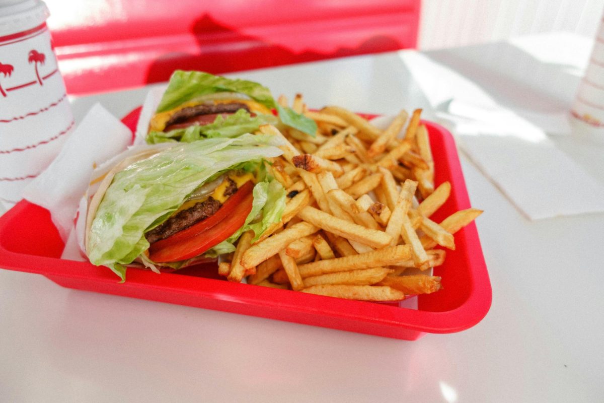
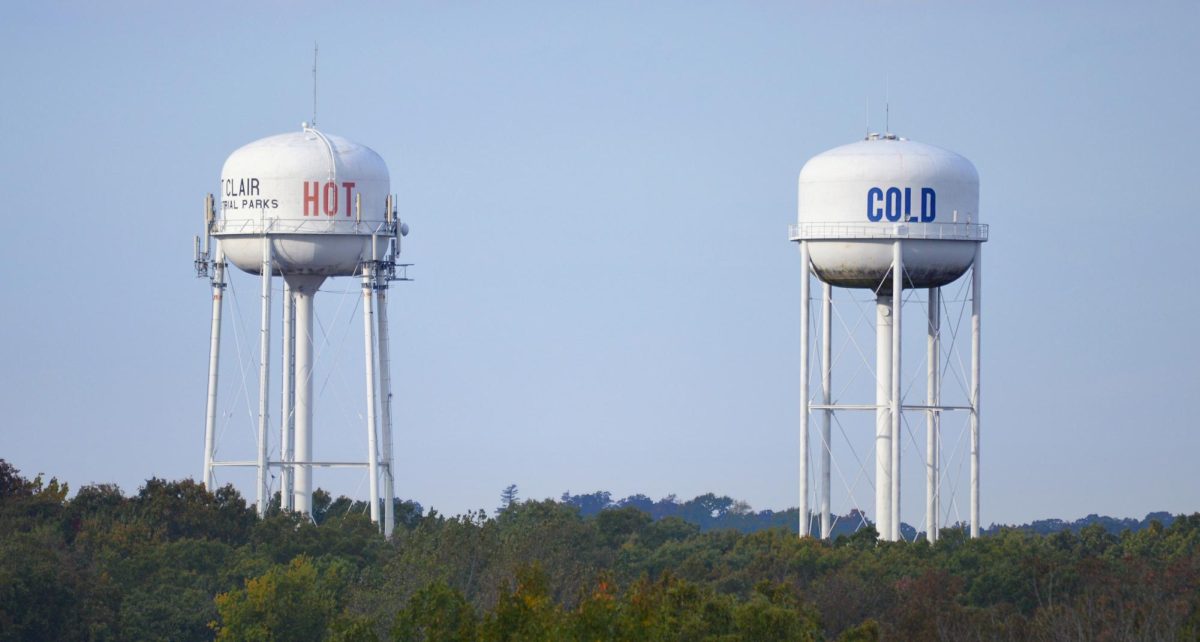
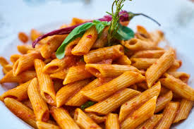
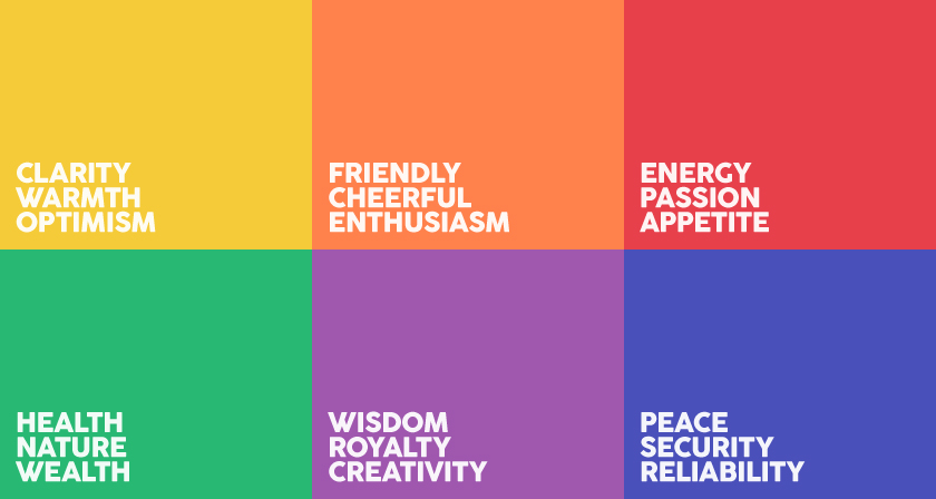
The color red, for instance, is used frequently by fast food places, both in their logo and decorating. As studies show, the color red increases blood pressure and speeds blood flow into the digestive system, thus speeding up the metabolism, which causes hunger. The use of red in many fast-food restaurants—McDonald’s, Wendy’s, In-N-Out, Pizza Hut, KFC, and Chick-fil-A—increases the consumer’s hunger and manipulates them into buying more food. Red also escalates one’s sense of urgency and stress by increasing blood pressure. If people feel stressed, they are more likely to buy on impulse, so red is often successful when used in clearance sales.
Taking a closer look at McDonald’s can give us more insight into how color can be used to create a specific atmosphere. The use of yellow and red in their mascot, Ronald McDonald, incites a feeling of excitement and high energy, which appeals to children. McDonald’s’ successful engagement of children ensures a continuing consumer appeal. However, the combination of yellow and red increases one’s sense of urgency, unease, and tension. This is successful in rushing out customers faster in order to increase customer turnover.
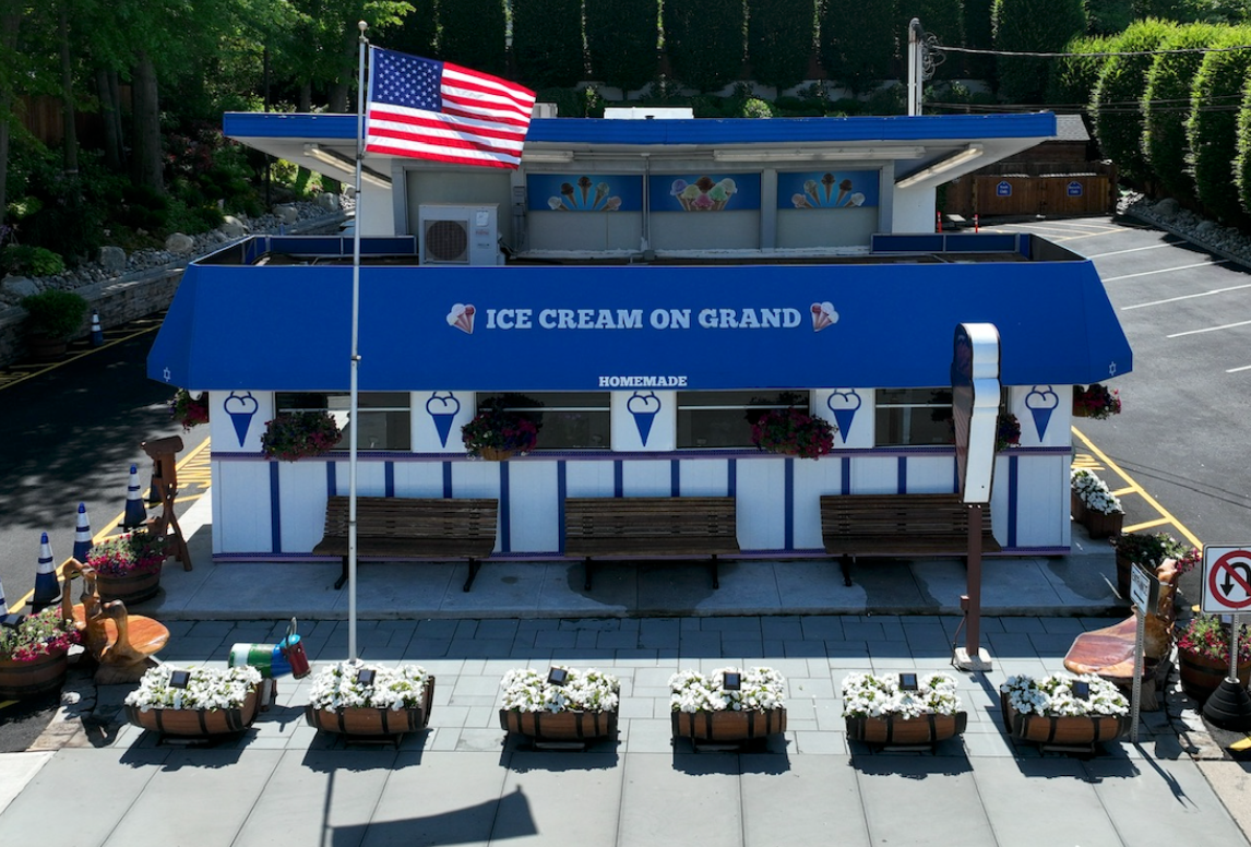
Conversely, the color blue slows the pulse and lowers the body temperature. Its calming effect can put one’s mind at ease and increase a sense of consumer loyalty, making it a common color used in bank advertising.
Also successful in calming customers, the color green is associated with nature and tranquility. In the United States, the color green’s association with money promotes a sense of wealth and exclusivity in the products it advertises. One top global brand which utilizes green as its main marketing color is Starbucks. The use of green coupled with the mermaid logo advances the tranquil and natural feeling. The green used at Starbucks has the power to relax the consumer, allowing them to take a break and de-stress while also increasing a sense of luxury in the product.
Purple is another color that gives rise to a sense of luxury and exclusivity. Purple dye originated in 1900 BC and its rarity soon associated it with the extremely wealthy and powerful. It became the color worn by Roman magistrates, the rulers of the Byzantine Empire, the rulers of the Holy Roman Empire, and later the Roman Catholic bishops. Purple’s appeal to royalty and luxury makes it a common color found in the marketing of beauty products. Additionally, because many relate the color purple to power, it manipulates them into believing in the efficacy of a product.
Color has a significant influence on one’s emotions, making it a useful tool in marketing. Through the strategic use of colors, corporations can easily manipulate your thoughts and actions. Looking out for the strategic use of color in branding allows one to increase their own marketing skills while avoiding manipulation as a consumer.